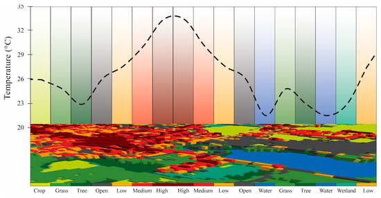
8 Temperature
This section will be focused on using Google Earth Engine to explore land surface temperature (LST) and compare how thermal patterns vary across different climates, spatial scales and satellite products. Building upon the early chapters of discussing Urban Heat Island Effect (UHI) in Policy, this section will also look at how land surface temperature can be used for UHI.
8.1 Summary
8.1.1 Land Surface Temperature
Land Surface Temperature (LST) is a parameter that reflects the interactions between Earth surface and atmosphere from regional to global scales(Li et al. 2023). Rapid urbanisation and increasing population have caused more land surfaces to be covered with concrete, asphalt and other impervious materials that absorb and retain heat. This raises land surface temperatures in cities, more frequent heatwaves, and raising concerns for planning, health and sustainability.
8.1.1.1 LST in GEE
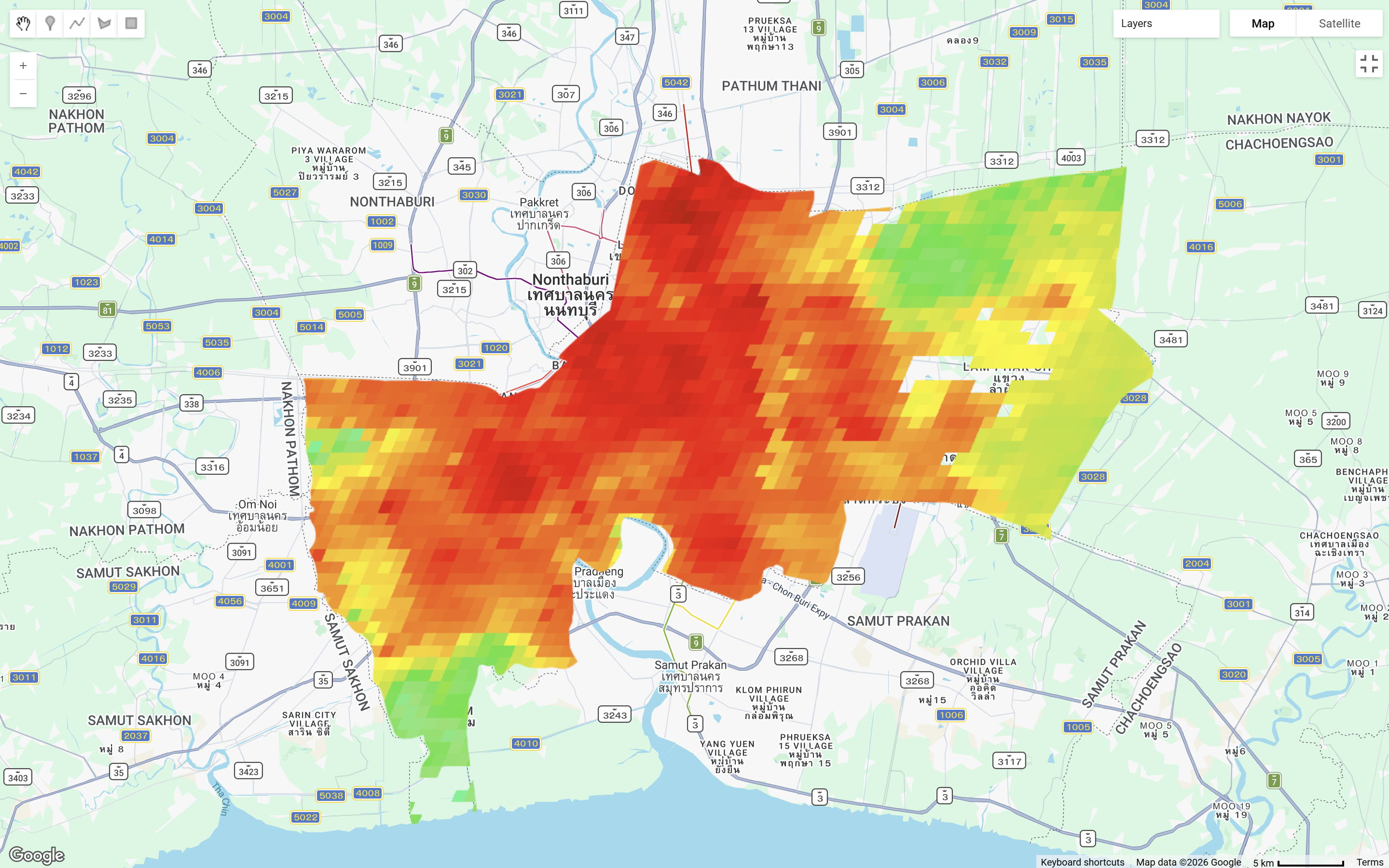
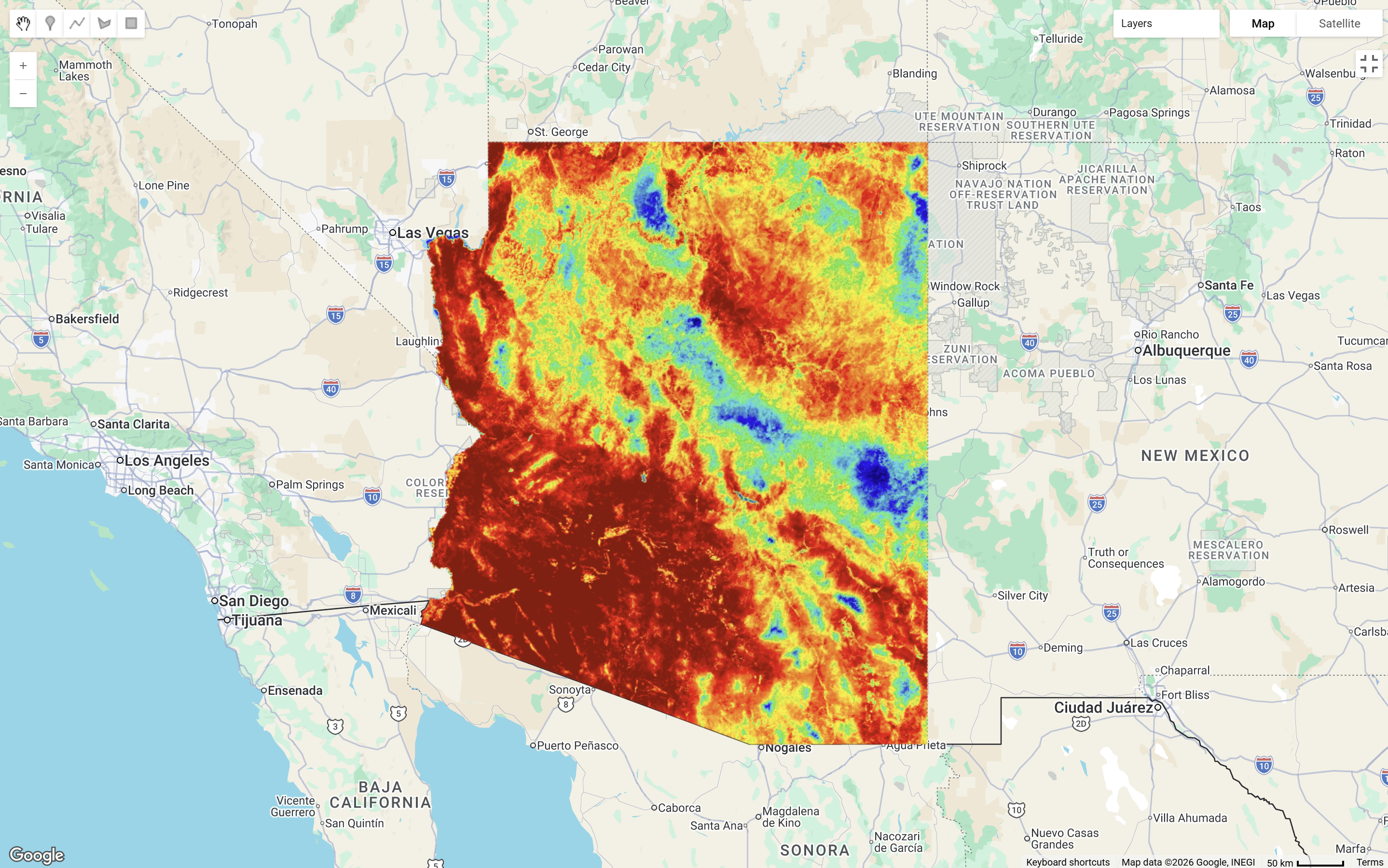
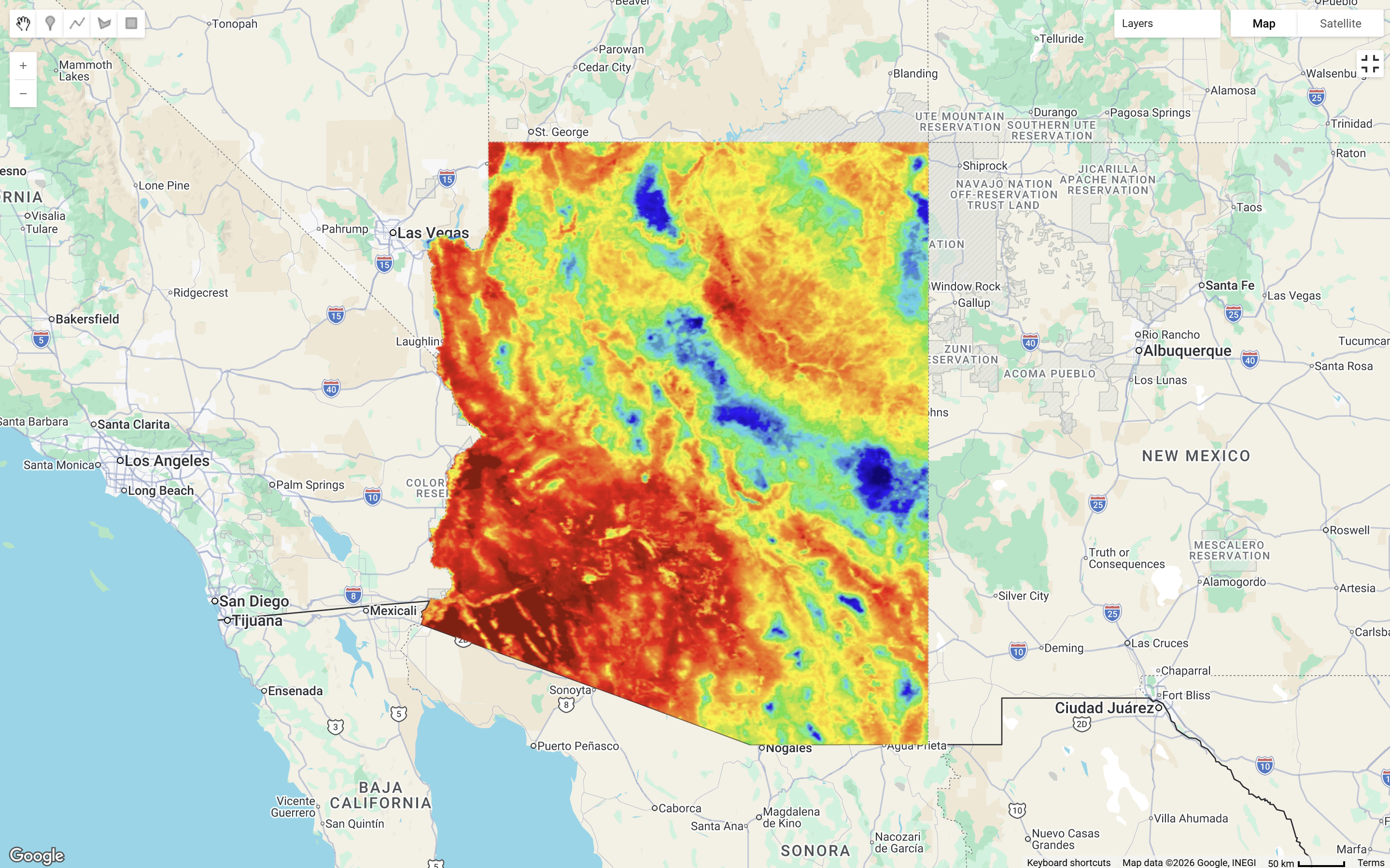
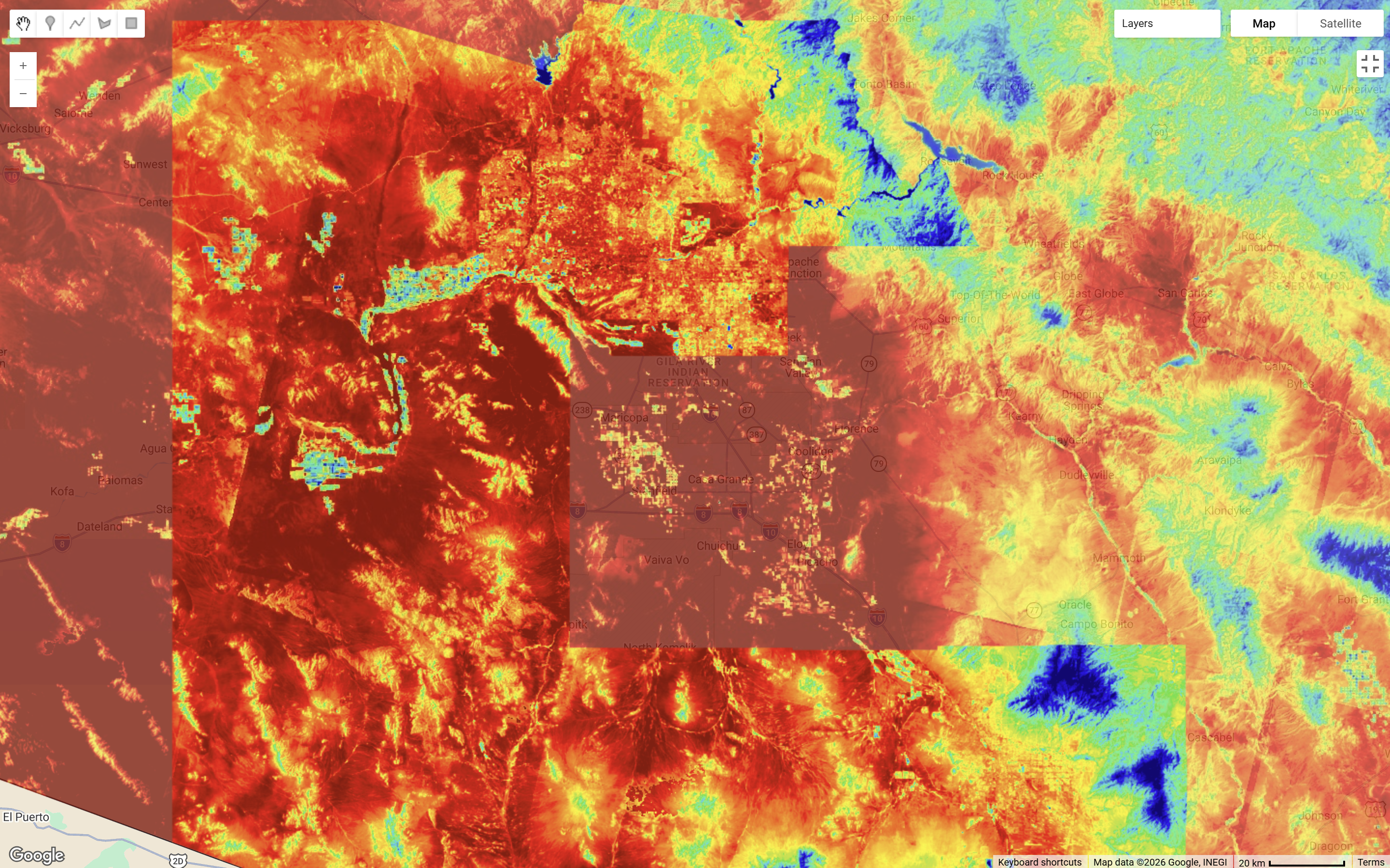
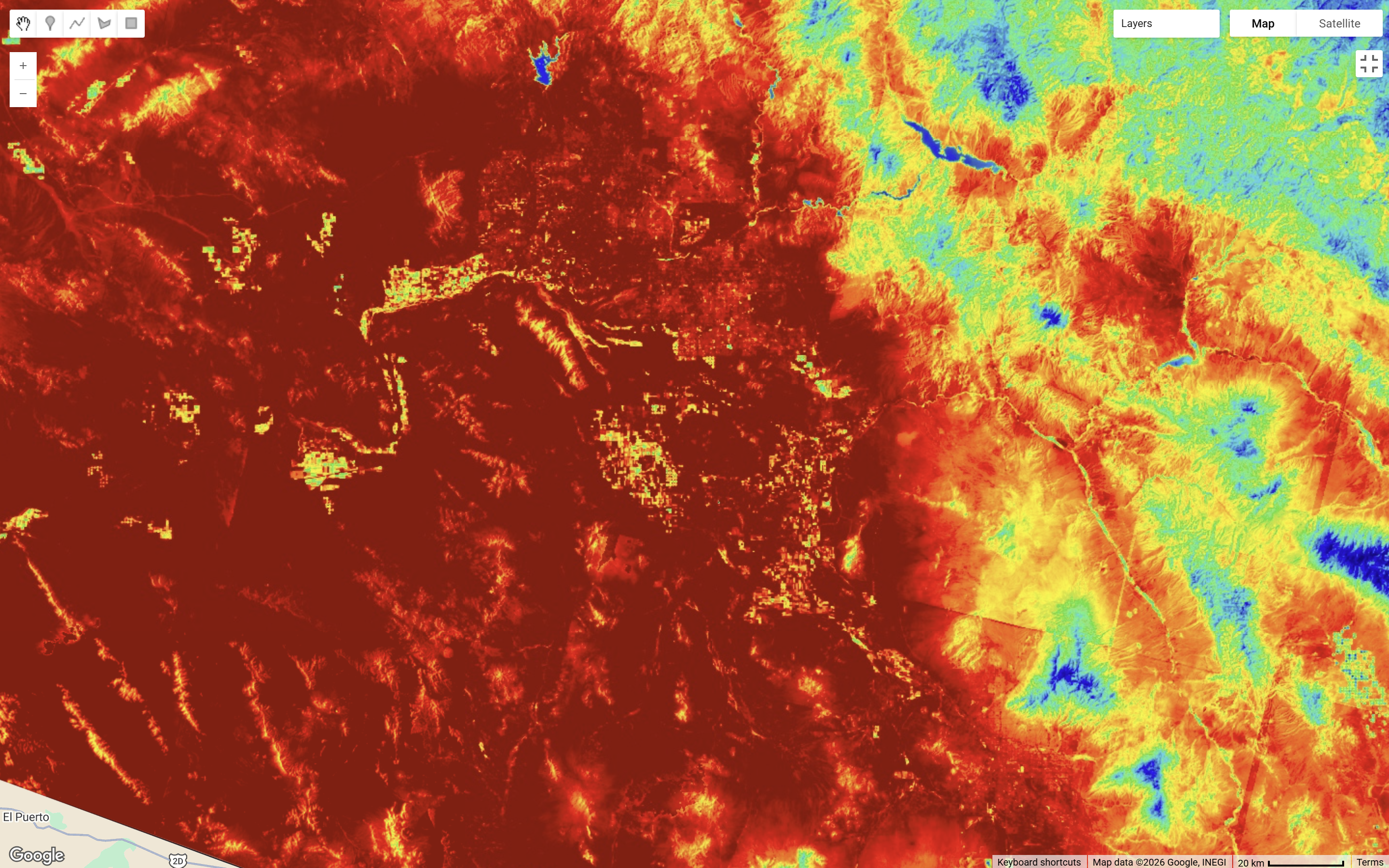
The below compares the difference between Landsat and MODIS for temperature analysis with a temperature range between 20°C and 55°C. Landsat gave much more spatial detail, which made it easier to identify finer scale thermal variation and smaller hot and cooler patterns within urban areas. In contrast, MODIS is more coarse, useful for broader temporal monitoring. Taking it further, I have been quite curious to look at how thermal patterns vary across different climate and urban forms. So the following will inspect Bangkok, Thailand (city scale) and Arizona, USA (state scale) LST under Landsat 8 and MODIS.
Bangkok, with its hot, humid and rainy climate, showed a much more fragmented thermal pattern, with finer-scale variation across the urban area. Arizona, by contrast, showed more extensive and continuous high-temperature patterns, which seemed consistent with a much drier environment and fewer cooling influences.
![]()
8.1.1.2 Time Series
Comparing the MODIS time series, Bangkok appeared more discontinuous, which I think is likely to be related to missing observations caused by cloud cover in its humid and rainy environment. Arizona, in contrast, showed denser and more continuous values, with a clearer seasonal trend and generally higher temperatures. This showed that temperature analysis is not only about climate differences, but also about the availability and quality of observations under different atmospheric conditions.
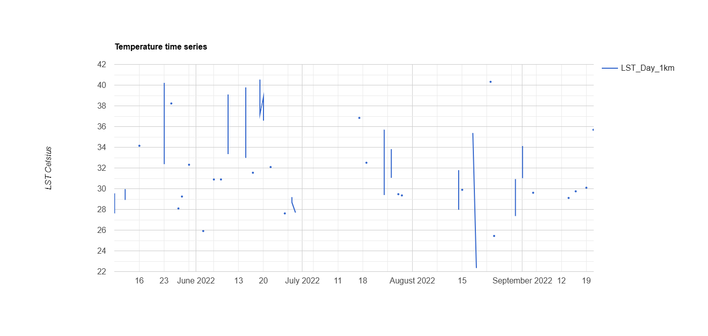
MODIS is more useful for plotting time series due to its high observation frequency, yet the trade off here is when we plot time series we will simultaneously lose the spatial element…
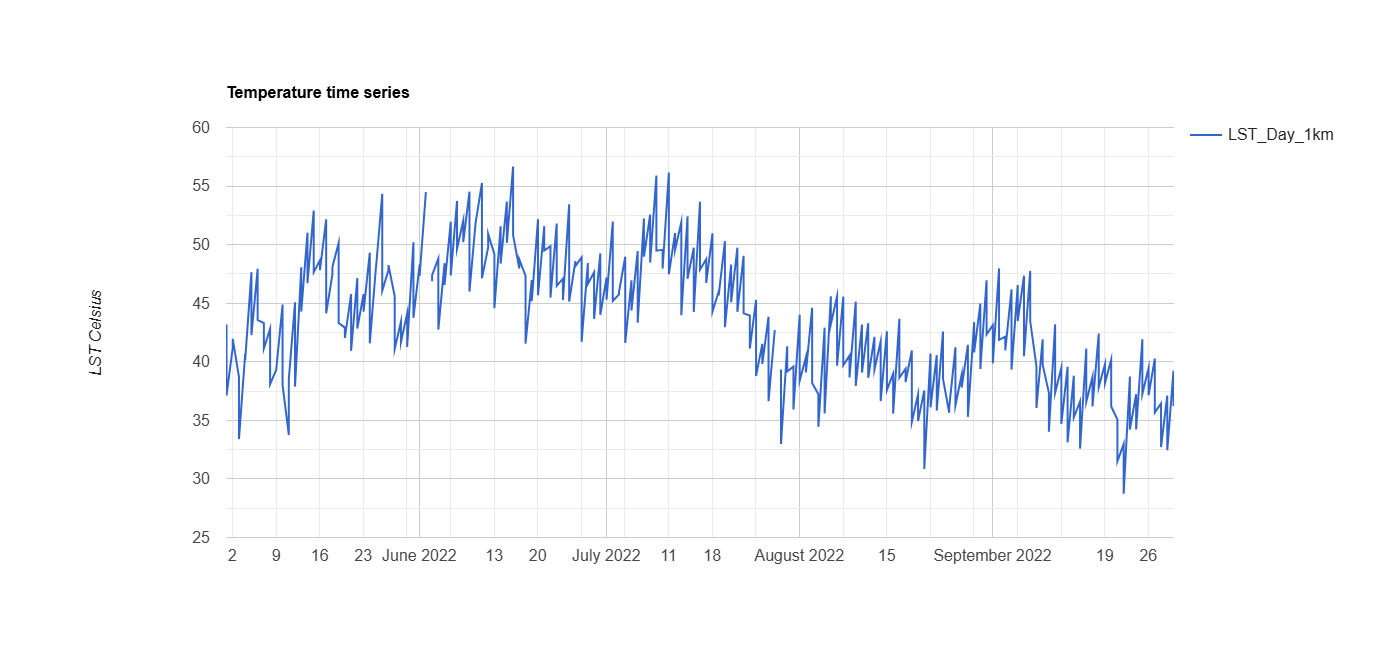
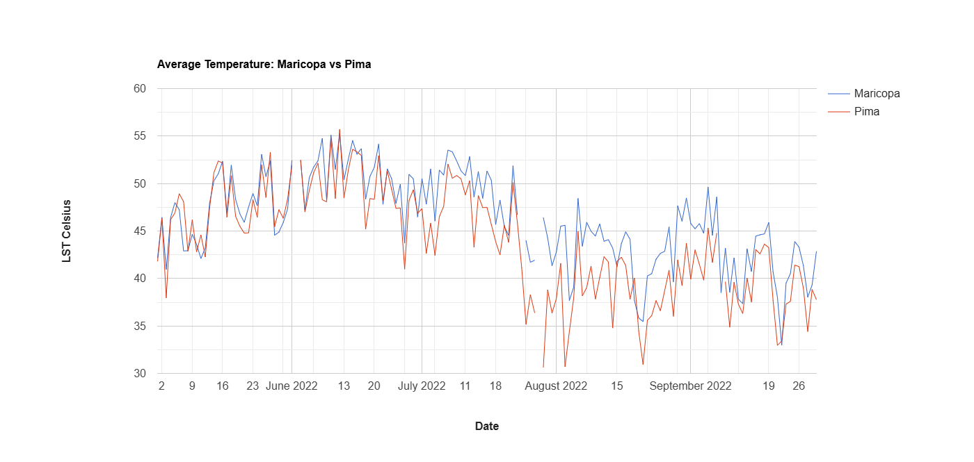
Focusing on a smaller study area …
Zooming into Arizona, I initially wanted to compare all level 2 administrative units in one chart, but GEE returned the error message “Response size exceeds limit”, so I narrowed the analysis to Maricopa and Pima counties. The chart suggested both counties remained consistently hot, with minimum temperatures around 30°C and maximum values above 55°C. Therefore, I adjusted the visualisation range to 30°C - 60°C to better reflect the actual distribution of values.
This also made me think of perhaps using reducer percentile function reducer: ee.Reducer.percentile([10, 20, 30, 40, 50, 60, 70, 80, 90], thermal comfort index or a categorised calculation of “Discomfort Index” based on temperature data instead may be a more appropriate choice (CASA0023)(Patel, Indraganti, and Jawarneh 2024; Sobrino et al. 2013). This will allow the visualisation range to based on distribution of values, instead of a set range.
GEE code for this practical can be found here.
| LST Strengths | LST Limitations |
|---|---|
|
|
8.2 Applications
Land surface temperature (LST) has been widely applied in urban climate studies to understand urban heat patterns, especially the Surface Urban Heat Island (SUHI) effect. Almeida, Teodoro, and Gonçalves (2021) note that Voogt and Oke (2003) proposed SUHI as a sub-classification of UHI, specifically addressing surface temperature differences between urban and rural areas. More recent studies seem to emphasise how land cover composition drives these patterns, vegetation cools surfaces while impervious cover heats them, and this relationship appears consistently across cities in very different climates (Shi et al. 2021). Despite these spatial patterns, findings across studies rarely agree directly, because climate context, urban form, and sensor choice all shape what LST actually observes.
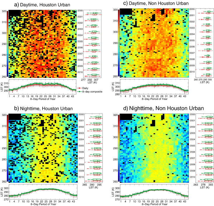
There are limitations methodologically. Satellites measure surface conditions indirectly and most cannot penetrate cloud cover, leaving gaps in thermal time series. To address this, most researchers composite MODIS LST products over extended periods to reduce missing data. However, Hu and Brunsell (2013) found that this inflates daytime SUHI values more than nighttime ones, with the effect growing the longer the compositing period. I think this explains why some studies prefer using nighttime imagery, as higher daytime solar radiation increases boundary layer instability and cloud formation, making daytime observations less stable. As seen below, nighttime imagery contains relatively fewer black pixels of missing or masked data:
Studies have extended LST beyond physical temperature analysis toward practical planning applications. Cetin et al. (2024) analysed LST and UHI dynamics across Kayseri, Turkey between 2013 and 2022, finding strong negative correlations between UHI intensity and vegetation cover, and strong positive correlations with built-up density. These findings gives direct implications for resilience and sustainable land use planning and UHI mitigation. Cetin et al. (2024) found a national garden under construction in the city centre was already showing cooler temperatures in that area, suggesting that even partial greening of can produce thermal improvements on local levels. It shows that LST is not just useful for describing where a city is hot, but can actually help planners decide where interventions should be targetted, monitoring cooling benefits and what kind of interventions would have the biggest cooling impact. Overall, things made clear that LST is not a straightforward measure you can apply universally. The choice of sensor, time of acquisition, and the local urban context all shape what the data actually presents. Findings always need to be read carefully before informing any planning decision.
8.2.1 Finally… Products for LST
| Resolution | Products | Spatial Resolution | Temporal Resolution |
|---|---|---|---|
| Low | ASTER, Landsat 8 Band 10 | 90 m, 30 m | 16 days revisit |
| Medium | MODIS, with Aqua and Terra | 1 km | Terra: N to S morning and Aqua: S to N afternoon, 1-2 days with 2 images a day |
8.3 Reflections
I am really stressing over clouds here. During my exploration in GEE, I realised how cloud coverage can really affect temperature outputs. Comparing the two cloud removing approaches has showed me how different pre-processing methods can affect temperature outputs. Using cloud cover filter still left a suspicious cool edge on the left side of the city, whereas the QA_PIXEL mask removed that area entirely, suggesting it was likely to be clouds instead of a real temperature pattern. But one more limitation here, it removed some values giving some empty pixels. This make me realise that filtering cloud cover is not necessarily always “the best” choice, especially in this case for temperature analysis as cloud coverage can still remain in parts of the image. Given that, pixel level masking seems to be a better option for more reliable outputs, yet it also creates a trade off in reducing the amount of usable data.
![]()
![]()
Apart from atmospheric effects, LST also depends on a many other decisions, including scale, data processing methods and interpretation. Even with these limitations, it is still a useful tool for climate adaptation, environmental justice, urban planning and potentially public health, when combined with demographic or land cover data. I feel like there is still a lot more to explore with LST, such as LST with NDVI, NDWI, NDBI and NMDI, etc. I personally think LST becomes more valuable when it is linked to heat exposure and vulnerability, how they influence the quality of life, accessibility of people, etc. Some studies show that hotter surface conditions are not experienced evenly across urban populations, which makes LST relevant to climate and environmental justice, which is definitely something I would be interested in exploring further in the near future.